Branding a fire truck factory: The Fort
The Fort’s signature (logomark + wordmark + location)
“Good luck with that,” I thought, standing in a musty, abandoned office. This old fire truck factory would come back to life, according to the leasing agent. I wasn’t convinced. It was a massive chain of buildings on the city’s south side, in a neighborhood that lost its hum. But the factory’s character was legitimate and memorable. A tour showed stout wooden pillars and steel struts, the smell of oil, and second floor barn doors that opened into… nothing, except a drop that would break legs in the brick-lined courtyard below. Giant letters read SEAGRAVE on the exterior wall. Everything was overbuilt, pointing to heavy industry that ruled this area a century before.
I couldn’t stop thinking about the place.
I had looked elsewhere for office space, from coworking desks to standalone structures. They lacked soul and character. This old factory had both. It also had genuine maker story flowing through its halls. Beyond the rich history, the site’s new owner had purchased the property to house his family’s 90+ year-old upholstery business. A glimpse into their operation was a time machine moment: people creating furniture by hand, from raw frame to final brass tacks. This was special.
That was the fall of 2017. By spring, I had visited again, met owner Justin McAllister, and saw the opportunity for Menges Design HQ. I signed a lease, moved in and began a work-for-trade retainer to brand the commercial leasing venture. Working with Drew Collins, we named it The Fort. Since 2018, I’ve worked with Justin to develop, refine and maintain the brand. My role is broad: writing, designing, lettering, photography, murals, website design and social media. The changes here are constant, and it’s been a blessing to watch fellow makers sign leases. With land acquisitions and more tenants, The Fort is nearing a massive renovation project. With that, a glimpse of the brand design and applications so far… and scroll down for a fun fact about this story…
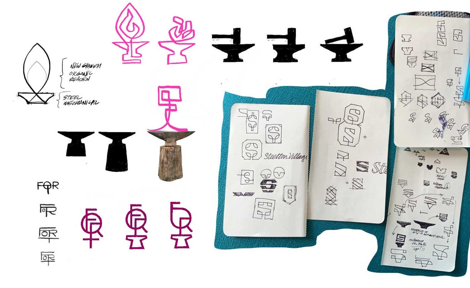
Raw sketches for The Fort and related brand design.
Sketches for The Fort’s wordmark, inspired by the buildings’ long halls and stout industrial heritage.
Painting old brick is time consuming—and hot, working on a rubber roof in the summer sun.
All the exterior branding was hand painted, true to the old school roots of The Fort.
Above: Promotion materials for The Fort.
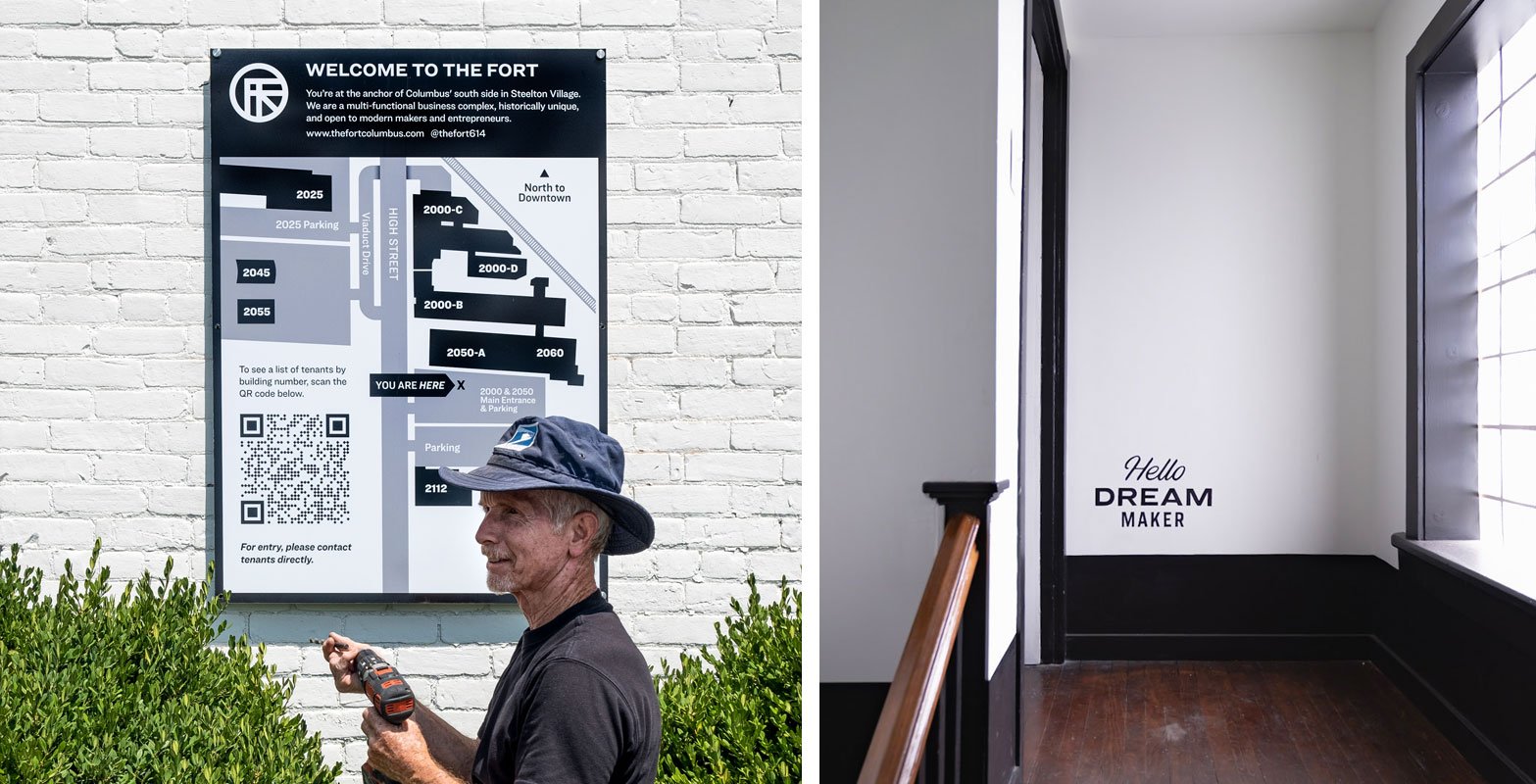
Rich installs the exterior map. Hand lettering greets visitors and tenants at 2000 South High Street.
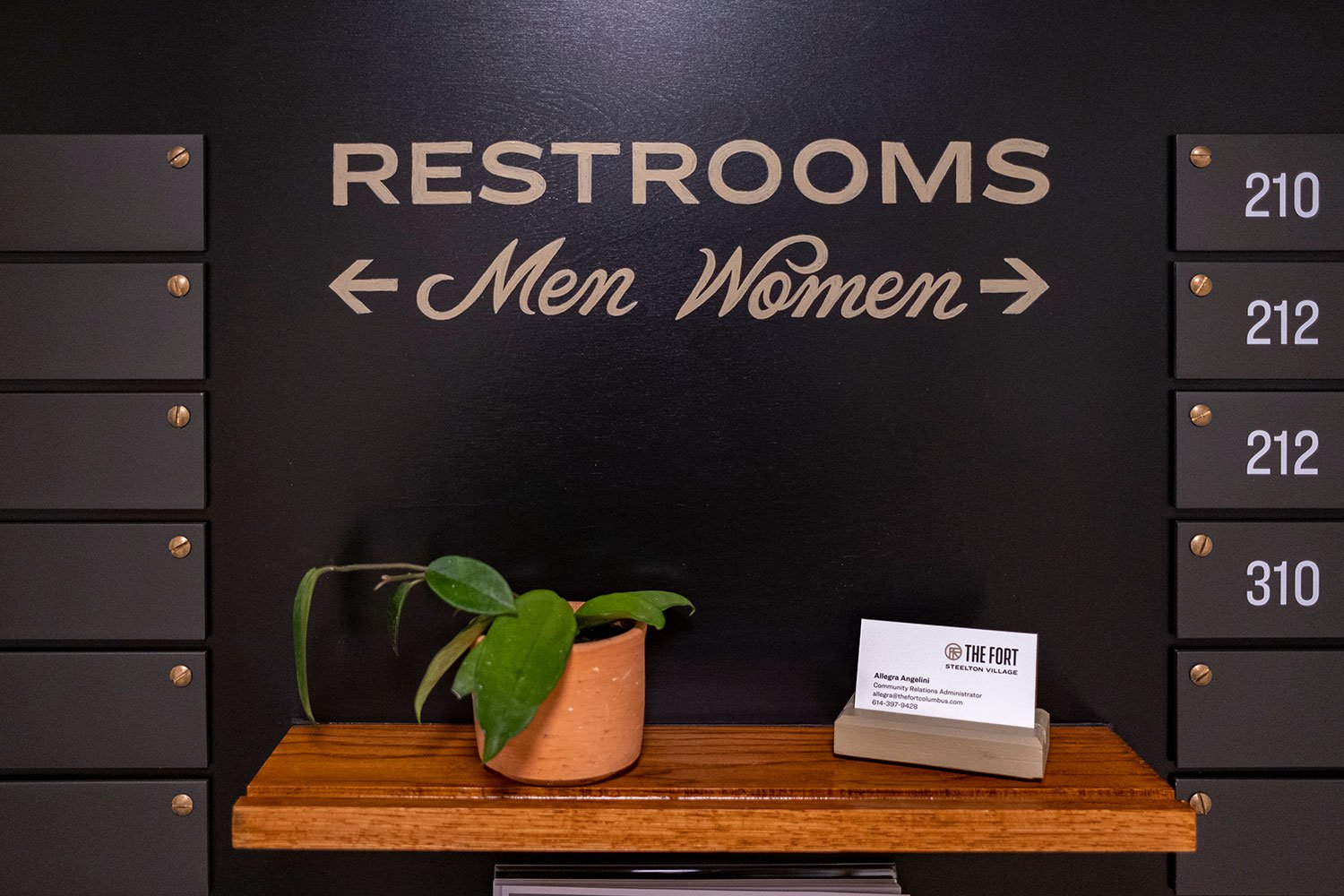
Wayfinding for the entry at 2000 South High Street. See hand lettered detail below…
Hand lettered signs are always top priority, but growth will force us to use vinyl where needed in the years ahead.
www.thefortcolumbus.com
About that musty, abandoned room that I stood in, pondering the fate of this place…
Across 230,000 square feet of available space, that little room became my first office at The Fort. Two years later, I moved down the hall to a larger space, inviting Fort tenants to collaborate on the new office design: prints, custom furniture, plants, mugs and more—all made at The Fort. A dozen makers contributed to the project, and you can see photos here (scroll to the bottom). More on that story soon…
Learn more about The Fort, located at 2000 South High St, Columbus, OH 43207.


