Can your logo do THAT?
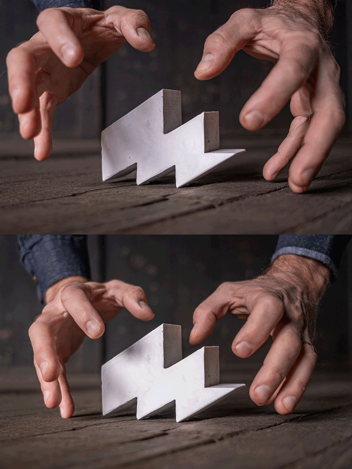
Concrete bookends, cast by Quill Concrete & Home Decor.
You don’t have to be a designer to know that simple is good. We all appreciate simplicity. Simple doesn’t demand you to decode (much). You just get it, quickly. No surprise that simple is a word we design nerds add to our list of attributes when we create things. Especially logos.
If your logo is simple, it’s often more legible. And it’s flexible; you can reproduce it more easily using different materials. Typically that means you can print your logo on complicated surfaces and the logo remains legible. Surfaces like burlap, rough stone walls, weathered wood. Or build a dimensional version of the logo from bone, stone, wood… or Jello.
When I designed the Menges Design logo—a lightning bolt turned to resemble a capital M, simplicity was a high priority. The logo also nods to the story of me getting struck by lightning. And the lightning represents the energy that we bring to—and get from—making things.
The best part? Having fun with our logo these past six years. Scroll down to see a few ways I’ve brought the logo to life—with the help of talented makers!
Cast in Stone, Carved in Bone
Simple shapes can be extruded in all sorts of ways. Cast in concrete? Sure! Carrie from Quill Concrete & Home Decor made a silicon mold of our logo and cast a few pieces. Use two for compact bookends. Set one on a shelf and add a little energy to your room. Contact us if you’d like to purchase.
This cute concrete lightning bolt adds energy to your room. We have ‘em in gray and this marble/white finish.
Hand carved in animal bone by Lee Kinder. Less than 2” wide!
Cut from raw wood by a 3D printer, used as a stamp. Or hand debossed into leather using a hot metal tip.
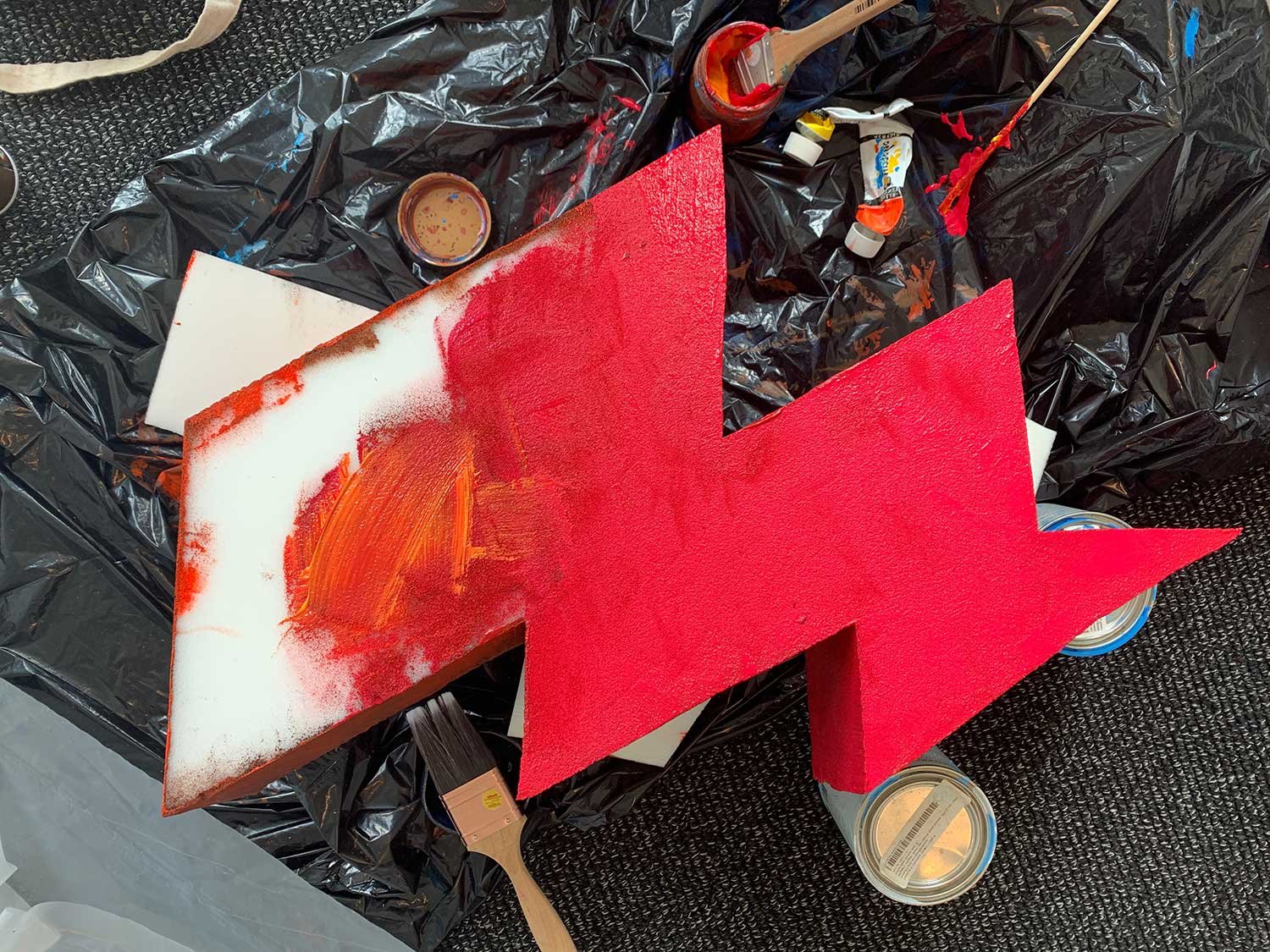
Cut from dense foam and painted for a video promotion.
Logo + Lolly Lollly
I met Lalese Stamps, owner of Lolly Lolly Ceramics, when she held her 100 Mugs show at The Fort. Soon after, Lolly Lolly moved into The Fort and created a drool-worthy studio full of life and red dust and energy. Lalese created custom mugs for our studio just before she moved home to Milwaukee. I drink Mission coffee from one of these mugs every day and love the restrained design and bold look.
Lalese Stamps from Lolly Lolly Ceramics.
Filled with grungy texture, or blind embossed on envelopes.
Sew versatile
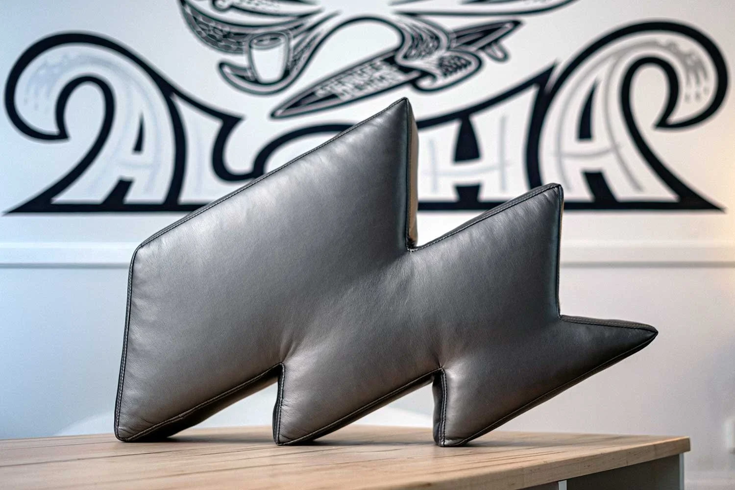
Sew the logo into a pillow? Sure! But the angles of the logo made it a challenge, said Mark Cryer of Fortner, the 90+ year old upholstery business and our neighbor at The Fort. Thankfully, Nat Della Selva was there to solve sewing the angles into a densely filled pillow, covered in metallic gray fabric.
Nat, in her hand made dress, holding one of two pillows she sewed for Menges Design.
Hand sewn pillow for the Menges Design office.
Can your logo work this hard? To be fair, many logos don’t fit this criteria. Your business, product or service may carry a serious tone that is not appropriate for playful applications like ours. But I would offer that simplicity is still critical for your logo. When you keep it simple, your logo communicates quickly. And it works harder to help you be seen, heard and remembered.
Thanks for stopping by, and contact us for logo and brand design guidance.


